
Project Goals
From looking through the product suite it was becoming increasingly apparent there was no design system in place which was affecting the product as a whole. We needed to create a successful design system with clear design standards, and a library of reusable components that can be customised and allow effective collaboration among team members. Project goals include:
Build a centralised repository to store design elements for both Designers and Engineers.
Eliminating design inconsistencies by developing standards to ensure consistency across all projects.
All elements should be accessible to a diverse range of users, including those with disabilities.
My Role
In this project, I partnered with another designer to achieve our objectives. My responsibilities were designing elements such as icons, themes, tooltips and buttons. Our collaborative efforts were focused on adhering to established standards, and making necessary adjustments to ensure that the final outcome aligned with our original expectations.
The Problem
The absence of a design system for designers and developers to consult with, led to increased inconsistencies throughout the product.
Variations in padding between buttons, disparities in stroke thickness on icons, and errors in colours within themes had become significant problems across the product and could affect the agent’s overall experience.
It was important to establish a system that would not only help current team members but also the onboarding of new staff.

The Process
The first step in this project was to conduct a comprehensive review of all components utilised in the Synthetix product suite. This enabled me to refine each component, avoiding additional changes that would result in inconsistencies.
I began by compiling a list of components, such as buttons, toggles, tooltips, input fields, icons, and themes, and proceeded to redesign each component while adhering to uniform design principles and guidelines.
After updating the components, another designer and I integrated them into ZeroHeight, providing a range of component variations and descriptions outlining their intended usage.
Please refer below to review some of the updated components.
Calendar
Given the calendar component’s usage throughout the product, such as in selecting date ranges for latest articles, setting birthdays in profile settings, or selecting date ranges for metric reports, I deemed it a top priority when I discovered visual inconsistencies in it during user research.
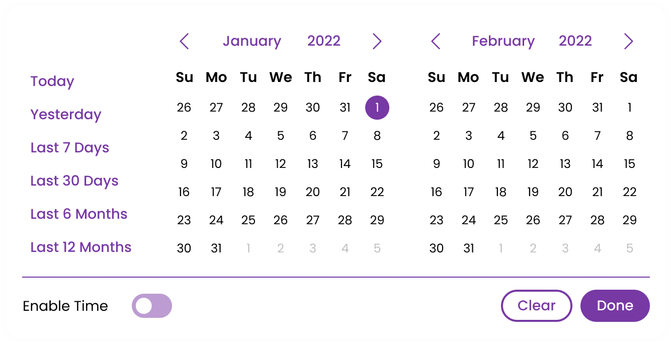
Broken Component
In terms of the calendar component’s visual design, several issues needed updating.
Firstly, the date selectors located at the bottom are exceeding the container’s boundaries, and the options are occupying too much space. Additionally, the text colour lacks accessibility.
After conducting user research, I discovered that date ranges are frequently used on a month-to-month basis rather than selecting only one month. Therefore, I kept this in mind while redesigning the component.

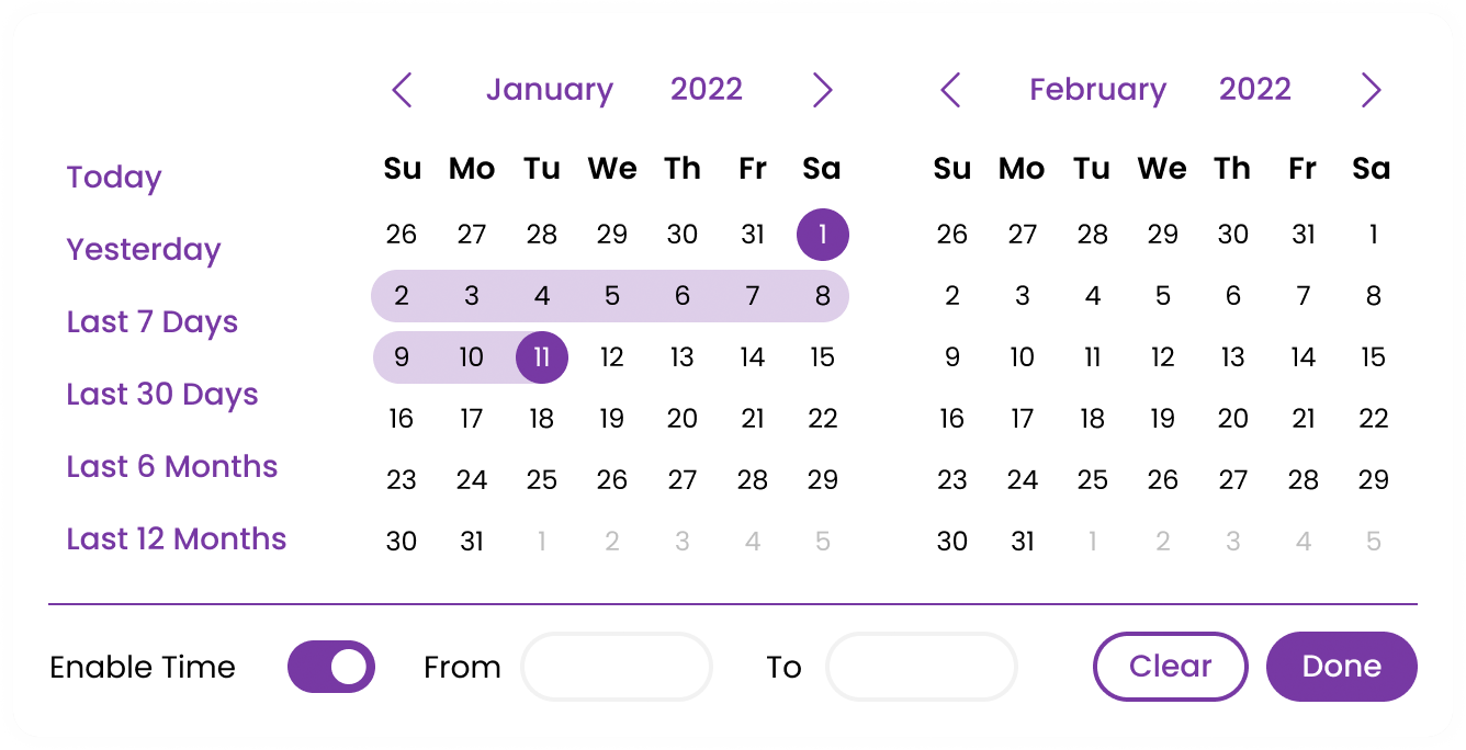
Updated Component
In the new component design, I relocated the date selectors to the left side of the component, as users typically read left to right, making it more intuitive to place them where the user’s eye naturally falls.
Regarding use cases that require selecting dates for metric reports, I added an option to choose a specific time at the bottom of the calendar, this allows for more accurate reports to be created. This option can be toggled on or off depending on the user’s preference.
Lastly, I addressed the colour issues, as the previously selected dates were challenging to see. I reduced the selection state to a lighter colour and ensured that it met accessibility guidelines.
Themes
During the component update, I allocated a portion of my time to improving product accessibility, specifically concentrating on themes. My goal was to produce 10 new themes that comply with WCAG standards of AA.
Previously, the product themes were pre-set and didn’t all meet WCAG standards, with random colours across the theme and issues with links.
Updated Themes
I created a list of the desired colours for each theme, ensuring that I included both light and dark variations.
Choosing appropriate colours required considering the user’s needs. As customers use the product for extended periods, up to 8 hours at a time, the colours must be pleasing and engaging while avoiding the potential for eye strain or headaches.
To meet the WCAG Level AA standard, I made sure that all the new themes met these criteria at a minimum.
One excellent accessible theme option is ‘SilverBirch.’ This option features neutral colours that are calming to the eyes, which enhances user efficiency and minimises eye strain.
User Feedback
When asked about first impressions after the new themes had been deployed, One user said :
SilverBirch


Other Theme Colours
Black Cab

Peony

Classic Blue

Icons
Icons are used across Synthetix products to convey information or to perform actions. Over the last few years, I have noticed the importance of having icons and their impact on users’ performance. Therefore I created a handful of guidelines to follow when designing or developing the product.
Guidelines
- Icons sizes should follow in multiples of 8 where possible – with the most popular dimensions being 16px and 24px.
Title icons with short but descriptive titles.
Icon stroke should always be 2.2pt.
The icon purpose should be clear, create icons to show today’s technology.
Use the same icons across all systems
Icons should be kept simple, without visual complexity
For icon variation, keep it consistent with the other relative icons
The Impact
As a design team, we have experienced remarkable outcomes. We have enhanced the speed and efficiency of our design process and leveraged existing components by reusing and adapting them.
Our efforts have also had a positive impact on scalability from a developer’s perspective. By establishing a standard for colours and themes, developers can utilise the same logic and apply it to their latest project.
Reflections
In conclusion, the design system project has proven to be a huge success and a valuable source of knowledge for the Synthetix team. Its implementation has resulted in significant improvements in consistency and efficiency across the entire design and development process, directly impacting agents and their experience with the Synthetix suite.
The use of Figma and Zeroheight to create the design system was seamless and intuitive and the engineers at Synthetix are thinking of taking the design system to the next level by using Storybook, a tool for evaluating components, automating testing, and reviewing documentation.
Looking back, involving a larger team in the process of the design system would have been beneficial in creating a shared understanding of the importance and purpose behind the project.